Tuesday, May 22, 2018

Graphic Design Semester 2 Reflection

What did I do this semester?

Magazine Layout

1.) What is it

We were to interview a local graphic designer and create two magazine spreads over the interview. We were supposed to have 15 questions ready before the interview but we did not have to use all of them in the finished product so that we would have a balanced layout of images and copy. The goal was to use your interviewee's style and tie it into the overall design of the spreads so that it looks like something that they created. The graphic designer that I interviewed was my friend's aunt, Wende Beeson. She works as a graphic designer for Baker University so a lot of her work is based off of Baker and their colors and events. She also did some outside, non-profit event posters.

2.) How long did it take?

We started this project towards the end of first semester and into second semester, because of some server fails, this project took a lot longer than expected. I luckily had a version in my trash bin on my personal laptop that only set me back a few steps. I would say that this project took about 2 months.


3.) Challenges

There were many challenges throughout this project. First, I don't find myself to be very skilled when working with large bodies of copy so it was difficult for me to work with that. This was also my first time fully working in InDesign so I was getting used to a new platform. The main challenge was working around our server crash. When the server crashed, it had deleted/lost all of our second semester work so unless you had a copy off the server, you had to restart the entire layout from square one. But luckily I had a backup.


4.) What did I learn and what was the feedback I received? What did I change?


I definitely learned how to work with larger bodies of text and what to avoid when doing so. A piece of feedback that I got was to try to fix the "boxiness" of the text, try to be more creative with the layout of the text so that it's not boring. I tried to wrap the text around a picture that went over the gutter. Another piece of feedback was the similarities in the work of the graphic designer and not putting them directly by each other. I had this somewhat fixed before the server crash but that was lost after it.


5.) Outcome and Opinion

I am actually pleasantly surprised with how it turned out. It could definitely use some more work but I think that for my first try, I did pretty good. I thought I did a good job at tying in Wende's style of work and making it my own in a way. I'm glad that I have a somewhat basic understanding of InDeign for future reference.

Prom Poster

1.) What is itAs the juniors in my class, we all had to make a prom poster for our school based on the theme given to us by junior committee. The theme this year was "A Touch of Jazz" with the main colors being black and gold. We would all make our own posters and then the top 5 would be chosen by the teacher advisors of junior committee and the committee would choose one from the five.


2.) How long did it take?

This project took a few weeks to complete. We did have a hard deadline because this was for an actual event and prom was coming up pretty soon.


3.) Challenges

The main challenge for this project was understanding what junior committee wanted. I wanted to make something that everyone would like but the theme had changed a few times and the thoughts of what the poster should look like changed so I tried to make mine fit with what all I heard. It was also challenging to make a poster that stood out because the theme caused a lot of our posters to look similar.


4.) What did I learn and what was the feedback I received? What did I change?

Most of the feedback was trying to make the design more original and unique because everyone kind of had a similar design to their poster. From the feedback, I changed the background of my poster from just plain black to a black brick background because I thought that it would help the originality aspect.


5.) Outcome and Opinion

My poster ended up being apart of the top 5 but it was not chosen as the final concept. I was just glad that mine was in the top 5 though because I thought that my poster looked pretty good. I was happy with the outcome. I think that I could have cleaned up small parts, but I am pleased with the final outcome. I really enjoyed this project because it was fun to try for something that the entire school would see and I liked the competition feel of it but that it wasn't super competitive in the class.

Dog Day Branding

1.) What is it

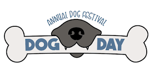
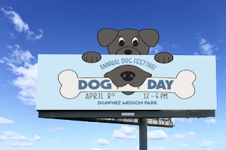
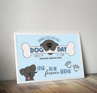
This project was supposed to be a completely made up company/business or event thatwe created an entire brand for. We created a logo, poster, billboard, magazine ad, newspaper ad, web ads, brochure, infographic, tickets, and a merchandise item. My event was called Dog Day. Dog Day is an annual dog adoption event held at Shawnee Mission Park's dog park. The dogs up for adoption would be wearing a yellowish orange collar and you can bring your own dogs to just run around, get exercise and play.


2.) How long did it take?

We have been working on this project since right after spring break and just finished a few days ago so over a month now.


3.) Challenges

The challenge I faced was that we were not told what all we would be making for this project before we chose our concept so it was kind of difficult to make certain advertisements for an event that normally would not have those advertisements. The infographic was probably the more difficult aspect, I personally am not the strongest at infographics so it was even more difficult to create on over an event that doesn't necessarily need one. It was also hard to choose a logo because I was torn between a few of them.


4.) What did I learn and what was the feedback I received? What did I change?

A lot of people liked my logos and overall concept so a lot of the feedback that I received was that my logos were "cute" and, surprisingly, my infographic did not turn out very bad and people liked it. I had to make one of my web ads less busy. I made my magazine ad more picture based than graphic based after the feedback on it.


5.) Outcome and Opinion

I liked this project and I liked that I chose an event that I enjoyed creating branding for. I am pretty pleased with the overall outcome and thought that I did pretty well and I think that I have grown in the branding branch of graphic design. I still have a lot to learn but I have definitely grown from the beginning.  


 Brochure:


Infographic:


Magazine Ad:


Newspaper Ad:


Tickets: 


Web Ads:


Merch:


KC Metro College Expo Logo

1.) What is it

This was a project given to the juniors in the middle of the branding project. It was just to create a new logo for the KC Metro College Expo.

2.) How long did it take?

This did not take super long, it took a couple weeks to complete.


3.) Challenges

The challenge mainly was that we did not have really any information on what they wanted their logo to look like. We all just had to take a shot in the dark and do what we thought would look best.

4.) What did I learn and what was the feedback I received? What did I change?

We did not really have any critics on this project because we were all busy with the branding project but we did find out that they did not want any graduation caps so a lot of people had to change their concept but I had a few to choose from so I just deleted the one with the cap and chose between the other two.


5.) Outcome and Opinion

Mine was not chosen for the top 5 which was kind of upsetting because I thought my idea was kind of clever but I also wasn't sure what they were looking for. I liked my logo though and thought that the project was a fun side project.


Time Spent in Class

I spent my time pretty wisely for the most part. When I finished early, I worked on small or random things to discover cool things to do in illustrator. I do think that I got kind of lazy towards the end of the year because I worked hard to get all of my work done but I finished early and wasn't sure what to do but then I received my physics final which was that we had to create a poster (infographic) over the physics of whatever we wanted. I worked on that and really enjoyed that and it made me thankful that I had this class to create a good poster especially compared to the others. 

Strengths?

I think that my project management skills have improved to where I am getting my work done so that I will have time to really look it over and notice small mistakes that can be fixed. I also think that my overall skills in illustrator have been growing and my knowledge of the platform has been increasing as well. I am proud of my advances that I have made this year in class. 

Improvements?

I think that could work of thinking of outside projects that can use up my time when I'm not working on class work. I also need to communicate more and get the opinions of others because I was very introverted this year when it came to that kind of stuff especially with the seniors. I was nervous about the thoughts of others so I did not communicate as much as a should have which I will hopefully change next year.

Summary

What'd I love most?

I enjoyed improving my skills as a graphic designer. I really loved having this class for two hours of the day and I love the environment of the classroom and the class in general. I surprisingly liked cutting and mounting because I got up on my feet and it looks very clean when done correctly and I enjoyed that.

Changes?

It was very difficult once Burdolski left because we had to adjust to a long term sub and understand her ways but it ended out being okay for me. I would change my introverted ways in this class because I think it would have helped me in many ways.

Overall Take-Away?

Overall, I will definitely use my skills that I have learned to try to put myself out there for outside projects and bettering my skills. I have learned that to really improve, you just have to keep going and keep trying until you get the end result that you want. 

Goal for next year?

I want to improve my understandings of both Photoshop and InDesign because I need to understand the features that both offer and when I have a situation where I need to use them, I want to know exactly what I am doing. I also just want to keep improving my skills and learn even more features in illustrator that would make my work better. A major goal is to have a good portfolio that I am proud of and that will help me get into a college that I want to get in. 

Final Thoughts?

I think that out of all of the years that I have been in eComm, this one has been the most valuable. Next year will probably, hopefully, one up this year, but so far, this year has been the year that I have learned the most. It has reassured me in that fact that I want to keep doing graphic design and I hope to major in graphic design. I have truly enjoyed this year in the graphic design aspect of things.

Outside Projects:

 I made a poster for a annual Bunco Party for the nonprofit organization called Feed His Lambs. They help feed struggling families.
This was my physics poster for my final over Thor's hammer, Mjolnir.


Monday, December 18, 2017

Graphic Design Semester One Reflection

What did I do this semester?

Name Typography 

What is it?

In this project, I was supposed to come up with 12 different adjectives that describe me or activities that I like to do. With those adjectives and activities I was supposed to use typography to portray those words in my first name. 

How long did it take?

 This project took around 2 to 3 weeks to complete. I first worked on sketches, worked it out in illustrator, moved it into indesign, printed the designs out and the cute and mounted them onto a matte board.

Challenges?

Most of the challenges that I faced were during the cutting and mounting stage of the project. I had to reprint and and recut multiple times. With the overall process of creating the names, it was difficult to portray an adjective and activity through my name while still making my name legible.

What did I learn and what was some of the feedback I received? What did I change?

I learned a lot more about typography than I had the past. Every year of graphic design that I've had had gone over typography and I learned a little bit, but during this project, I learned how type can effect a whole project. Most of the feedback I received was about the legibility of my name from further away. I needed to up the weight on some of my strokes are make my name bigger. I went in and tried my best to fix some of the designs to make them more legible.

Outcome and Opinion

Overall, I really enjoyed this project and thought that it turned out well. It was a good project to start off the year. Although it was challenging at times, I liked the challenge and it was fun to try to think outside the box.


Handwritten Typography

What is it?

In this project, I was supposed to created a greeting card or a holiday card and have my own handwritten type be the main focus. My friends and I have a Christmas in October party and it was around that time of the year so I decided to created my card based on that. 

How long did it take?

This project took about 3 to 4 weeks. I started with some rough sketches of different ideas and cards. When I decided on a sketch, I recreated it but more cleaned up, almost like it had just been printed. After that, I scanned my sketch into the computer and cleaned up what little needed to be cleaned up. 

Challenges?

The most challenging part was trying to make my sketch look perfect. I had to redraw it multiple times and rescan it multiple times. Another difficult task was finding the right colors. It is difficult to make Christmas and Fall colors look good together. 

What did I learn and what was some of the feedback I received? What did I change?

I learned even more about type than I thought possible during the making of this project. The feedback that I received was the legibility of the card from far away and how to make it "pop" at first glance. The card said "Christmas in October" and the "in" was difficult to see from far away. I tried my best to make it easier to read by switching up the colors a little bit and upping the weight. 

Outcome and Opinion

The outcome of this project is not my favorite, I feel like I could have done better or that I should have chosen a different concept. The colors, in my opinion, do not go well together. I like the layout of my type but the color just takes away from it. I enjoyed the process of creating the whole project, but it was not the best outcome in my opinion.


Ezekiel's Enchantments 

What is it?

In class, I was given 4 different papers, one had two letters, another had an animal, one had a mineral, and the last one had a number. My letters were EE, my animal was an ostrich, my mineral was copper, and the number I received was 3. I had to create a company based on this information. I decided on Ezekiel's Enchantments. Ezekiel's Enchantments in a small shop where Ezekiel makes custom dreamcatchers with ostrich feathers and copper wiring. 

How long did it take?

This project took a long time, I had to create a logo, a letterhead, a business card, an envelope, an app icon, and a store mockup. There was a lot of time and effort that went into this project.

Challenges?

The challenges that I had were creating and choosing a logo that fit well with the product and the overall feel of the "company." I created multiple logos in illustrator after sketching them out, some of my concepts looked better in sketches than digitally. 

What did I learn and what was some of the feedback I received? What did I change?

While creating this project, I learned of important a clean and concise logo is. The feedback I received was about how I could even out the sizes of the symbol and the type. I was also reminded again on how important type is and its effect. 

Outcome and Opinion

I enjoyed this project a lot and I think that it turned out quite well, I know there is a lot of room for improvement, but I am not upset with the outcome of the project.

Logo:


Business Card:


Letterhead:


Envelope: 


App Icon:


Store Mockup:


How did I use my time in class?

I feel as though that I have used my time in class wisely. I do not have the creative cloud programs installed on my own personal computer so I cannot work on the projects at home. I was absent a few times during this semester but I never felt behind. If I needed to, I would come in before school or during lunch to work, but I rarely needed to. Most of my sketches are created outside of school so thatI have more time to work on the computers when I am at school. If I do finish the class project early, I will work on client work if I have any, or I'll work on random graphic design projects. 

Areas of strength

I feel that I have a creative eye when it comes to graphic design. I try my best to think outside of the box and yet make my projects make sense. I will judge posters or logos anywhere at any time and think about if I thin its a good poster or logo. 

Areas of Improvement 

I need to get better at using Illustrator and Photoshop. I will have these cool ideas that could turn out amazing, but I don't know how to execute them well on the computer. 

Summary

What did I love most?

I loved the freedom that I was given this semester. If I wasn't working on a class project, I was working on client work or just graphics that I enjoyed creating. 

What would I change?

I would probably change my communication skills, I feel like I was not confident enough to go around and ask others to give feedback on my works.  I would probably try new ideas on some of my projects as well.

Overall take-away

I learned a lot about graphic design this semester. More than I have in any other graphic design class that I have taken. A lot of it being typography. Typography is everywhere and it effects the entire graphic.

Goal?

My goal for next semester is to learn more about Illustrator and Photoshop and to try and learn new tricks in the programs and just improve on my technical skills.

Final Thoughts

Overall, this has been my favorite year of graphic design. I have learned a lot and I am hoping that I can create a solid portfolio for future jobs and colleges. 


Thursday, May 25, 2017

Web Design Semester Reflection

Technology 

          Learning how to use Dreamweaver and TextMate were both challenging and exciting at the same time. I enjoyed learning the coding and how it all worked. I think that learning the code is important because sometimes it can be difficult to edit your website through design or live view. But I defiantly improved on my technical skills in web design this semester/year. 

Collaboration/Communication

           During my time in web, I never felt like I couldn't ask someone for help or what they thought of my project. I had no problem with asking the people around me or asking Mr. Olson. I think that being able to communicate with the people around you is very important because you're going to need that skill for your entire life. The only challenging part of communication/collaboration is taking constructive criticism.

Project Management

          I think that the biggest problem I had in web design was the project management. I think that I work better under pressure and in this class I felt that there was nothing pressuring me to get things done. I still have my sites turned in, it just took me longer to finish the certain sites. I also felt that when I was excited for a project, I would finish it before it was even due because I enjoyed making it.

Leadership

            I don't think that there was much opportunity to show leadership in this class. If people were to ask me for help or what I thought on their site/project, I would help and give feedback. 

Strengths

            One of my biggest strengths in web design is that I have a creative eye and I know what colors look good together. In other words, I am better at the "design" aspect of web design.

Weaknesses

             As much as I enjoy coding, I am not the best at it. I want to learn more about coding in both HTML and CSS.  I could also improve on my technical skills in general.

What am I going to do with what I learned?

            Sadly, I am not going into web design next year, but I do think that the basic skills that I learned in web will be very beneficial in the future. I think that being able to create a website is a good quality to have when you are looking for jobs. I am going in to graphic design next year and I think that I will still be using my index page to showcase some of my works. Overall, I'm glad that I took web deign.

What would I change?

            I hated Flash. I would have changed the whole Flash projects. I also would have changed the way that we learned how to code. I wanted to learn more about coding, we got a small lecture over coding at the very beginning of the year, but it wasn't enough for me. I also, personally, did not like following video tutorials for creating websites, but that's just my preference. 

Conclusion

           I'm glad that I took this class. I think that it was an important class to take and I am glad that I have a basic understanding of web design. I will definitely use the skills that I have learned in the future and I had a good time in this class. 

Crupper Composition:

http://eravensonline.net/students/351hmc08/ 

Tuesday, May 23, 2017

Graphic Design Semester Reflection

What did I do this semester?

          In my graphic design class this semester, we took our previous knowledge of a specific graphic designer or movement of our choice and created a poster promoting a gallery at The Nelson. We also created 4 typography graphics out of quotes or lyrics or our choice. Lastly, we worked on rebranding a company of our choice which meant, creating a new logo/combination mark, a business card, a letterhead, and finally, and envelope. 

Saul Bass Poster

          Towards the end of first semester, we were asked to choose from a list of graphic designers and movements to research and create a power point about. From the list, I chose the designer, Saul Bass. His art was unique and different from what you would normally see and that really caught my eye. The way that he made his art his own was inspiring. His graphics are easy to recognize and are always interesting to look at. We were asked to create poster in the style of our artist or movement, promoting their work at the Nelson Art Museum. One of his works that really caught my eye, was his posters and covers for the film The Man with the Golden Arm. In his arts for the film, there is this arm that is almost like a signature for the film and Saul Bass. Every time I hear Saul Bass, I think of that arm so I decided to put that in my poster.

Research


          To make sure that my poster looked the best that it possibly could, I had to research what the importance of a poster is and what makes a good poster. The main idea of a poster is to get inform others about a certain event in the simplest form possible. You want all of the necessary information on the poster without making the poster look too busy. I researched some of Saul's posters and also tired to make it look like something that he would create. I looked at multiple fonts and found the perfect font to represent Saul's style (Viktors Littl Creepy Horror). I found Saul Bass's works usually used dark colors to portray a cynical feel. I tried to create the same kind of feel by using the colors that he used (dark, warm colors).

20 Layout Sketches

           In addition to the research, we had to create 20 different sketches of ideas for our poster. I knew that I want "Saul Bass" to be the first thing people saw when they glanced at my poster. I made different sketches of how I could portray Saul Bass through this poster. I had to think about where every piece of information would go and how large I wanted the details to be. I then started to add certain graphics and fonts that I thought would represent Saul. I settled on one of the first sketches that I drew. Going into this project, I already had an mage in my mind of what I wanted my poster to look like, it was just a matter of where to put everything and how to make certain information to pop.

Conclusion

           I felt that I did a good job on this poster. It was a fun project overall and I enjoyed creating it. In the beginning, I already had a outline in my mind of how I wanted the poster to look so it only took me a few days to create. The feedback I received was all positive. The only thing I needed to change was the more important information should be outlined.

Typography

          The typography unit was definitely my favorite of all that we have done in graphic design. We had to find quote or lyrics that somehow connected to us and meant something to us. I chose all of my lyrics from my favorite band, Twenty One Pilots. Their lyrics are very inspiring and meaningful to me and I felt that they would all fit for my "vision" for the art boards. 

Kitchen Sink

          These lyrics are from the song Kitchen Sink. The song is about helping you to defeat your "demons" thats are in your head. The lyric I chose is "empathy might be on the brink of extinction." I chose this lyric because it is, sadly, becoming true in this day and age. I wanted "EMPATHY" and "EXTINCTION" to look as if they were deteriorating. I added smoke to the background because I thought that it fit well.


Forest

          This design was inspired by the song Forest. It is about living off of emotions and how they effect your life, how we are afraid too what comes next. I chose the lyric "I don't want to be heard, I want to be listened to" because there is a big difference between being heard and being listened to. I thought that every single person can relate to this in some way. I made "HEARD" into sound waves because I felt like it fit well with the word. I didn't want a bright background color so I chose a light brown. 


Screen

           This lyric is from the song Screen. It is about hiding who you truly are behind this metaphorical "screen." I chose the lyrics "excuse us while we sing to the sky" because the line right before it is "while you're doing fine, there's some people and I, who have a really tough time getting through this life so, excuse us while we sing to the sky." It means that even though you could be enjoying life, there are people out there going through hard times and to just take that into consideration. I made the art board look like a sky as if the reader was looking up to the sky. 


Lovely

          The final typography creation was from the song Lovely. The lyric I chose from it was "I will make you believe you are lovely." I just love the message of the whole song and how powerful one line of lyrics can be. I chose a both a cursive and flowery fonts because I felt that they fit well with the lyrics. I chose a pastel pink as a background color for a soft feel.


Rebranding

          The company that I chose to rebrand was Fuego. Fuego is a store that sells a mix of accessories, apparel, jewelry, and novelty items. The store was established in 2003 and started in the Pacific Northwest but is spreading. Fuego's main purpose is to bring the huge passion for art and style into a small store. 
          The last project in my graphic design class was to rebrand a company of your choice. We first had to create multiple symbols and logos. We had to pic our favorite symbols and create combination marks. A combination mark is a graphic with both a symbol and text to convey a brand image. After we picked our favorite combination mark, we then had to create a business card, a letterhead, and an envelope.  

Combination Mark


          While creating the combination mark, I wanted to incorporate some sort of fire because fuego is Spanish for fire. We were asked to add color to our graphics, but with my graphics, most of mine looked better in just black and white. When I added the color to this specific mark, I liked the way that I created the different shades. I understand that in a real flame, the colors would be lighter towards the bottom, but I felt that the graphic looked better with the opposite of that. I used a complementary and monochromatic color scheme.

Business Card

           For the business card, I put the combination mark to the left of the information and created a boarder around the front. Since I felt that the front was a bit busy, I made sure that the back was simple and sweet by just having the background color that grey-blue and sticking the flame in the center.


Letterhead

           On the front of the letterhead, I put the mark in the top, left corner and the information in the top, right corner. To separate the mark and information from the actual letter itself, I put a faint line under mark and information. To balance out the top and bottom, I put the same boarder that I had on the business card, on the bottom of the letterhead. On the back of the letterhead, I put that same boarder on the top and bottom. I also to kept it simple by putting the combination mark in the center.


Envelope

            For the envelope, I wanted to change it up just a little bit. Instead of having that same boarder, I just took the colors and created stripes and put them in the bottom corners. I put the information on the top left corner with the symbol next to it. I put the combination mark in the top right corner.


Final Display

Here is the final display of the rebrand:


Time in Class

         With the time that I had in class, I felt that I used it well. I got my work done on time except for when I would be absent. If I finished the main project, I would at least start on some of the extra projects. If I was given feedback that I found helpful, I would go back and correct or change things based on the feedback I was given. I do not have Illustrator or Photoshop at my house so there isn't much that I can do outside of class. 

Strengths

           My strengths in graphic design are making sure to make each project my own and being creative. I try my best to make each design look the best that they can and I work hard. 

Need Improvements

           I need to improve on my photoshop skills and how to use Photoshop because I would like to get a better understanding of how to edit photos. More in depth than what we had in first semester. I also should improve on knowing how to use specific tools in Illustrator and becoming better at using it. Learn some new tips and tricks to try to become an expert in Illustrator. 

Overall Conclusion

           The project that I loved the most this semester was definitely the typography unit. I enjoy finding lyrics or quotes and turning those words into something more. I like the impact that type can have. I felt that out of all the projects, the type gave the most freedom and room to use my creativity to its fullest potential. 
           During this semester, I learned more about how graphics really impact everything. Whether it be the colors you chose, the placement, the alignment, or the graphic itself. My goal for next year is to improve on my Illustrator skills and to become a better graphic designer in general. 

Extra 


Before:                                                                                                 After: