What is Fuego?
Fuego is a store that sells a mix of accessories, apparel, jewelry, and novelty items. The store was established in 2003 and started in the Pacific Northwest but is spreading. Fuego's main purpose is to bring the huge passion for art and style into a small store.
The Rebrand
The latest project in my graphic design class was to rebrand a company of your choice. We first had to create multiple symbols and logos. We had to pic our favorite symbols and create combination marks. A combination mark is a graphic with both a symbol and text to convey a brand image. After we picked our favorite combination mark, we then had to create a business card, a letterhead, and an envelope.
The Combination Mark
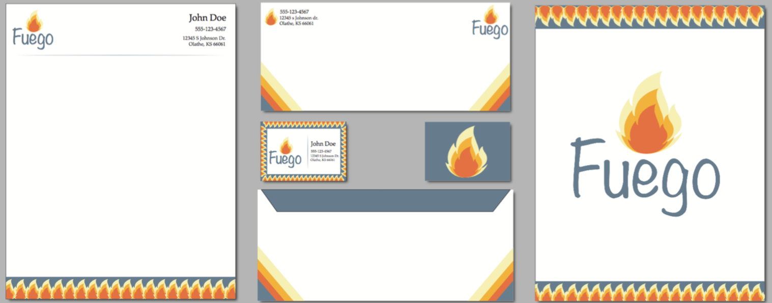
 While creating the combination mark, I wanted to incorporate some sort of fire because fuego is Spanish for fire. We were asked to add color to our graphics, but with my graphics, most of mine looked better in just black and white. When I added the color to this specific mark, I liked the way that I created the different shades. I understand that in a real flame, the colors would be lighter towards the bottom, but I felt that the graphic looked better with the opposite of that. I used a complementary and monochromatic color scheme.
The Business Card
 For the business card, I put the combination mark to the left of the information and created a boarder around the front. Since I felt that the front was a bit busy, I made sure that the back was simple and sweet by just having the background color that grey-blue and sticking the flame in the center.
The Letterhead


 The Envelope

 For the envelope, I wanted to change it up just a little bit. Instead of having that same boarder, I just took the colors and created stripes and put them in the bottom corners. I put the information on the top left corner with the symbol next to it. I put the combination mark in the top right corner.
Final Display
Here is the final display of the rebrand:
No comments:
Post a Comment