Tuesday, December 20, 2016

Topic Site Reflection

What was this assignment and what was the process? What did I learn?

          In my web design class, for our final, we were asked to create our own website about a topic of our choice. My topic was the Olathe Northwest Soccer program. I used the html coding and css styles that I learned from previous projects, I was able to get a good starting layout for my site. I had 5 tabs/pages, Home, Boys Teams, Girls Teams, Coaches, and Records. I was unable to fill in all the content due to timing and trouble with the layout. I was trying to center the links but I had to get help from my instructor. I also had to put a minimum width so that the banner would fit in the div.  I learned new css styles and html tags to help customize my website.

What would I do differently? What would I do the same?

          I would probably change how I large I made the banner because it made it hard to work with div. I also probably would have changed how I did the tabs, I think that it looks ok and I like the style of it, but I did something that made them difficult to work with. I defiantly would not have changed the layout of my site, I like the way it is set up with the links across the top, right under the banner. 

Thoughts?

          Overall, I enjoyed this project. I wish I had more time to work on it. Because making the layout had so many difficulties, I did not have time to put in barely any content. But I did enjoy not having to follow a tutorial and trying to figure out certain things for myself, even though I did have to ask for help on a few things.

Here is one of my pages that has a little bit of content:

Friday, December 16, 2016

Semester 1 Final Reflection

What did I do this semester?

Photoshop:

          My favorite photoshop project was the Nature Man Challenge. It took me a approximately 3 class hours to complete. One of the biggest challenges was the hair because I still wanted all of details of the hair. I learned a lot of new skills in Photoshop doing this project that I previously had no knowledge of, like creating layer masks. A lot of the people that I showed this to, seemed to like it a lot. If I had to change something on this project, it would probably how I went about making the hair. I tired to make the hair look like a wave and I feel like it is hard to tell that that was what I was trying to do. Overall, I am pleased with the outcome of this project. I think that if I had more time to go back and fix the hair, it would look better, but it still looks good.


Illustrator:

          We have done a lot in Illustrator this semester, but my favorite would have to be the Raccoon Postcard.  The raccoon itself took about 3 class hour, the background took about 2. One of the challenges I faced when creating this had to be when I used pathfinder. When we had to follow the tutorials, it was hard to understand what certain directions were. Along the way, I learned how to use the warp tool and got a better understanding of the pathfinder tool. All the feedback I received on this project was very positive. If I could go back and change something, I would redo the whole raccoon now that I understand how to use pathfinder. Overall,  this project was probably my favorite out of all of my work because it was fun to create and i enjoyed making it. 

How did I use my time in class?

          At the beginning of the year, I used my time very well but I also thought that we were not given  enough time to work on certain projects. That improved throughout the semester, though. I felt like I used my time better on the projects I enjoyed, but I would get sidetracked on the projects I didn't necessarily like. If I finished early on the projects, I usually worked on the challenges that our teacher assigned as extra credit, but I rarely finished those because when I started, we were then assigned a new project and then a new extra credit opportunity. Before I would work on the extra credit, I looked at parts of the project that I could improve upon and tried to fix little problems. Outside of class I do not have the the Adobe programs to really work on projects. I try to come in early on some days and work in Illustrator or Photoshop, but mostly I stay after school to do that. I have also downloaded free software but they are a lot harder to understand because I am so used to the Adobe programs.

What are my areas of strength as an employee or graphic designer?

          I pick up on new skills and information pretty quickly. I understand how to use most of the tools in both Illustrator and Photoshop, but I would not say I am an expert. There are many aspects of both Illustrator and Photoshop that I have no clue on how to use. When I am assigned a project, I try my best to personalize it, make it look the best that it can. I use my creativity to help my projects visually appealing.

What are my areas in need of improvement?

          There are many areas where my graphic design skills can improve. Infographics is one of them. I like to make everything look balanced and clean, which can be a good thing, but sometimes it doesn't look good on an infographic. My Photoshop skills could also be improved because there are many thing I do not know about the program. We have spent more time in Illustrator than Photoshop, which doesn't bother me, but I would like to have a better understanding of Photoshop than what I have right now.

Summary

          This semester, in graphic design, I loved creating the raccoon in Illustrator, it was was fun and enjoyable. I like Illustrator a lot. One thing that I would change would be that we didn't work in  Photoshop as much as I would have liked. I learned a lot this semester and I now have a better understanding of graphic design as a whole. One goal that I have next semester is to just improve on my skills overall. I thought I did better than I thought I would've this semester and I am pleased with the outcome.  

Tuesday, November 29, 2016

The Top 6 Predators of Earth Infographic

The Infographic

        For the past couple weeks, my graphic design class has been working on infographics. We were asked to research any topic of our choice and create an infographic about it. I chose to research the top 6 predators on earth (not including humans). I chose this topic because I enjoy learning about animals and I thought it would be a fun topic.  
       I wanted the whole layout to be organized, clean and balanced, so thats what I did. I made sure each animal got the same amount of space and same with the header and footer. For the animals, I found pictures and outlined them with the pen tool in Illustrator. After I outlined each animal, I filled each outline in black because I felt like it would look cleaner without all of the details.
       I know that there is a lot of room for improvement but I am pleased with how it turned out for my first infographic. 

Friday, October 7, 2016

The Raccoon Project

Illustrator

        For the past couple of weeks, my graphic design class has been working in Illustrator. We were asked to create a raccoon and then add on leaves, berries, and/or nuts. After we finished that portion of the project, we had to design a postcard that had our raccoon somewhere on it. We used many different tools in Illustrator, such as, pathfinder, the ellipse tool, etc. I personally liked working in photoshop more than I did Illustrator but I still enjoyed working on this project.

The Raccoon

This was my original raccoon. As you can see, the background is not very appealing, I felt that the deadline for this was a bit rushed which is why I did not spend much time with thebackground. I had time after school to go in and work on the background, so that is what I did.
        This is my modified project. I went in and added a skyline, some clouds and grass. I enjoyed creating this raccoon, even though there were some difficulties with the pathfinder tool. I do need to work on adding more depth in the background but like I said before, I felt like the deadline was a bit rushed.


The Postcard

        After we finished our raccoon, we had to create a postcard and put the raccoon somewhere on it. We also had to use our own handwriting for the typography. I decided that my postcard would be winter holiday themed. I enjoyed this portion of the project the most because I had more time to personalize it and make it my own.


Final Thoughts

        Overall this project was very fun and enjoyable. I am looking forward to working more with the Adobe software and creating new projects.  

Monday, September 19, 2016

Fun With Photoshop


What did I learn/do in Photoshop?

     In the past couple weeks my new graphic design class has been working in Photoshop and editing photos. We learned how to remove unwanted objects or visuals from photos and also how to add on little details with the content-aware and clone and stamp tools.

Challenge

This was my challenge finished product after working through the tutorials:


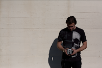
We were supposed to use our knowledge of the Photoshop tools and be creative. We were supposed to use pictures of nature and find a way to join the man with the pictures. I chose water as my picture and I tried to make his hair look like a wave, emphasis on the word "tried." Overall, though, I think it looks cool.


For the first picture, we were asked to remove unwanted spots and items with content-aware.
This step was quite easy in my opinion because all you had to do was use the select tool to select the unwanted item and then press "delete" (on a Mac) or "backspace" (on Windows).


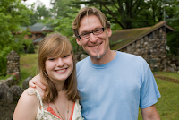
For the second picture, we were asked to remove the graphics on the father's shirt. To do this we had to use the lasso tool to make a more detailed selection. After selecting the graphic, we used the patch tool to remove it. We also used the patch tool to "clean up" the shirt from unwanted creases or folds.


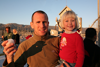
For the third picture, there was a large pole that was behind the man's head that we had to remove. To remove it, though, we had to use the clone and stamp tool. This tool copies other elements of the photo and can paste that element onto other parts of the photo.

For the fourth picture, we had to remove a tag from the jacket using the clone and stamp tool and the healing brush.

For the fifth picture, we had to remove dirt specks from the boy's face. To do this we used the spot healing brush.


For the sixth and final picture, we were asked to take three photos of this girl and put them into a collage. We had to use clipping masks, the clone and stamp tool, and the quick selection tool. For the center picture, the girl's arms were cropped out of the picture so we had to take another picture of the girl and use a mask to add on to her arms.


Wednesday, May 18, 2016

End of Year Evaluation

Graphic design:


Northwest Gradient: 

For my graphic design project, I chose to do this one. I really enjoyed this project, I like the way it looks. I think this one is my favorite design that I have done all year. 

Animation:

Animated Name:

I chose this animation for this project because it is my all time favorite animation that I have done. I put a lot of time and effort into this project, I wanted it to look great. I came in early every morning to try and finish it. I was really happy with the outcome. It may not look like much, but it took me a long time to finish, and when I did, I was overjoyed. The full animation is on my blog.

Video:


Just Do It:

For my video project, I chose my first video that I ever made in e-Comm. It does have some flaws, but I enjoyed making this project. My teacher agreed to be our main actor which was the best part, he was great. Although I am not taking video next year, he made video my favorite class.